Back around the turn of the century (Y2K), I had a small, developing training and consulting company on my hands – CellStream, Inc. founded in 1998 – and we were all about the Internet and Internet based everything. So we promoted Internet based business solutions and learning. We were early adopters of cloud based Intranet services, and of web conferencing. Way before Cisco acquired Webex (March of 2007 for $3.2B), we were Webex customers. We used Webex to teach courses online – it was novel and cool at the time. Some students loved it, some hated it, but I think we all had a sense that what we were experiencing was a taste of the future to come.
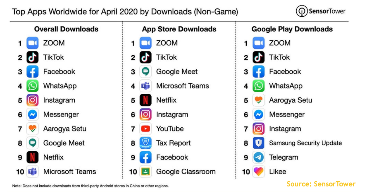
Of course, from today’s perspective, this history and its growing pains all seems comical, especially in these COVID-19 days where working from home and learning on the Internet for meetings and learning has become so crucial. So crucial, that the number of downloads of the Apps that do video meetings and conferencing is amazing:
The reason I’m recalling this history is because I think my experience of 15+ years of weekly use of Webex-like tools, places me in a unique position to review them and comment on them. In this review I will deal with some – not all – of these tools: Webex, My Room, and Zoom.
Before we jump in, there are a couple of general points I would like to make.
- Teaching or communicating using a Web Based Conference or Training tool requires that teachers/presenters are keenly aware of their audience, and that the audience is continually engaged. The answer to this challenge is partly up to the teacher/presenter, and use of a proper presentation toolset – the screen has to move and come alive, not just animated bullet points, as one example. It is also partly the application itself, it must support interactivity: status, polling, hand raising, and other methods of student/participant involvement and engagement.
- Let’s talk about video – what I mean by this is the video camera feed from the teacher/presenter and/or the students. Video consumes bandwidth. Remote users may find video to be experience defining – not in a positive way! Delay, Jitter, paused screen, poor quality are all BIG problems and distractions. While having a team or family “vid-con” is fine, even then, cameras are sometimes not properly positioned, there are lighting issues, and so many more challenges. The result is that many people either use a screen shot still, or produce no video at all.
- Screen sharing is absolutely the only way to go for the teacher/presenter. When the screen is shared, markup, annotation, and other tools must be present on the presenter system. Having built-in markup tools, or the need to upload documents to use the markup is not really important as it used to be. In the early days, you had to import your PowerPoint or document in order to mark it up.
- Most of these training/presentation systems have equal features, equal audio and video performance, and I will not dwell on those items to save both me and the reader some time. Instead, I will focus on the deltas, the quirks that are different either in a positive or negative way.
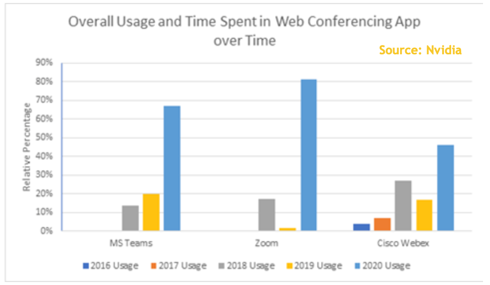
Here are some market figures:

OK – enough said, let’s get to the details. I have screen shots of all three platforms and I have redacted/blurred private information.
Webex
Let’s begin with Webex itself. I have the most experience with Webex. Webex has always been expensive. When I first started using Webex, I was paying nearly $1500/mo! Remember, this was before Cisco acquired the company (May 2007). While prices have dropped dramatically since, even today, it is by far not the cheapest. Therefore, the user/subscriber expects the absolute best for higher price. This means best performance, best interface, best everything, with all the latest industry leading and trend setting features.
Prior to being bought out by Cisco, Webex was just that. It was the best. New features and functionality were introduced regularly. But at some time around 2010 – the introduction of new features leveled off, and honestly the interface has not changed nor improved much in the past ten years. Some would argue that functionality has reached a plateau, and there are few other features to deploy. I disagree wholeheartedly, though one can imagine as long as the Webex development team meets the top priority customer requirements – Cisco itself – what else could matter? I think that therein lies the problem with Webex – it is stagnated, and it should not be stagnated.
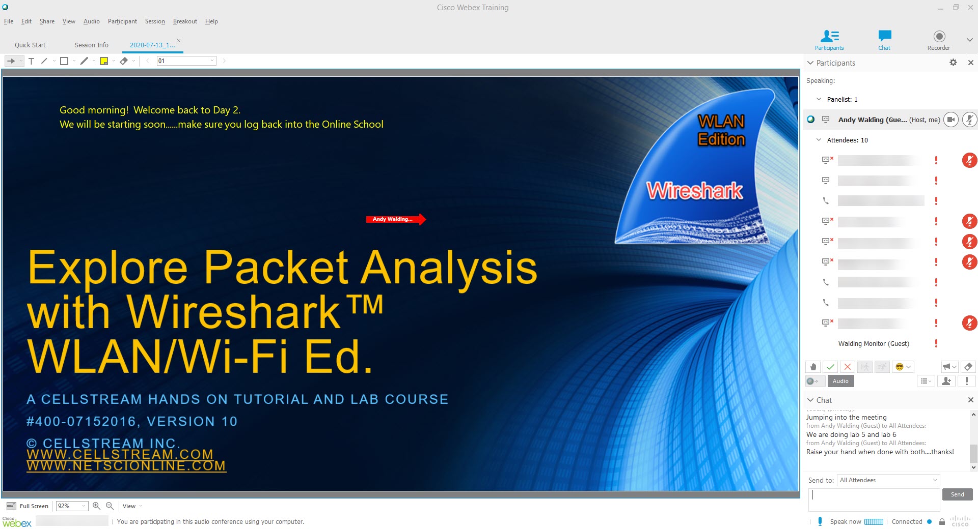
There are features I absolutely love in Webex. First thought: almost everything basically works. While Webex has a now aged interface, meaning it really has not changed much over the years, it is both predictable and fairly intuitive for most users. I love that you can see attendee attentiveness, meaning if they drift off to another screen, an exclamation point shows up next to the attendee names in the presenter screen (in the screen shot above, the students were all doing labs – so wee see the red exclamation points). This attention tracking is a great way to make sure everyone has not gone to sleep or lost interest and giving the teacher/instructor an opportunity to reel everyone back to the screen. Webex comes with a great set of statuses (muted, hand up, check for yes, X for no, speed up, slow down, and mood emoticons) that students/attendees can use. That said, teachers/presenters must prompt attendees/students to use these tools, and actively incorporate that into their style and process.
Sharing student/attendee screens (called passing the ball in Webex) is easy, but annoyingly buggy in Webex. For example – let’s say I upload several files, when I switch between presenters (I love students/attendees sharing their screens), the presenter information is lost! This has been true since day 1 with Webex. This is a terrible behavior and almost inconceivable that Webex has not corrected it in all these years.
Another HUGE annoyance is the way Webex chat works. Let’s say as the teacher/presenter, I post something in Chat, and you join the session a little late. You don’t get to see the history of the Chat area before you joined! What? This annoyance has always been the way Webex chat works, and it is terrible. Sure, you can easily overcome by re-pasting stuff into the chat – but as a student/attendee and as a teacher/presenter, I find that having to be repetitive is – well – repetitive and silly.
One last thing on Webex, the interface is not space (screen real estate) effective, neither on MAC nor Windows platforms. The attendee list could be compacted by at least 30-50%. The Chat area should be moveable for better space allocation. Actually, it would be nice to be able to choose the layout I prefer based on the type of class/presentation I am conducting – like a profile setting. I’ll stop here.
HP My Room
My Room by Hewlett Packard is not popular as say Citrix, but I have used it a lot in the last ten years, and I have rarely used Citrix. I don’t think many people outside of Hewlett-Packard even know it exists. I won’t discuss history here, but I will get into the details.
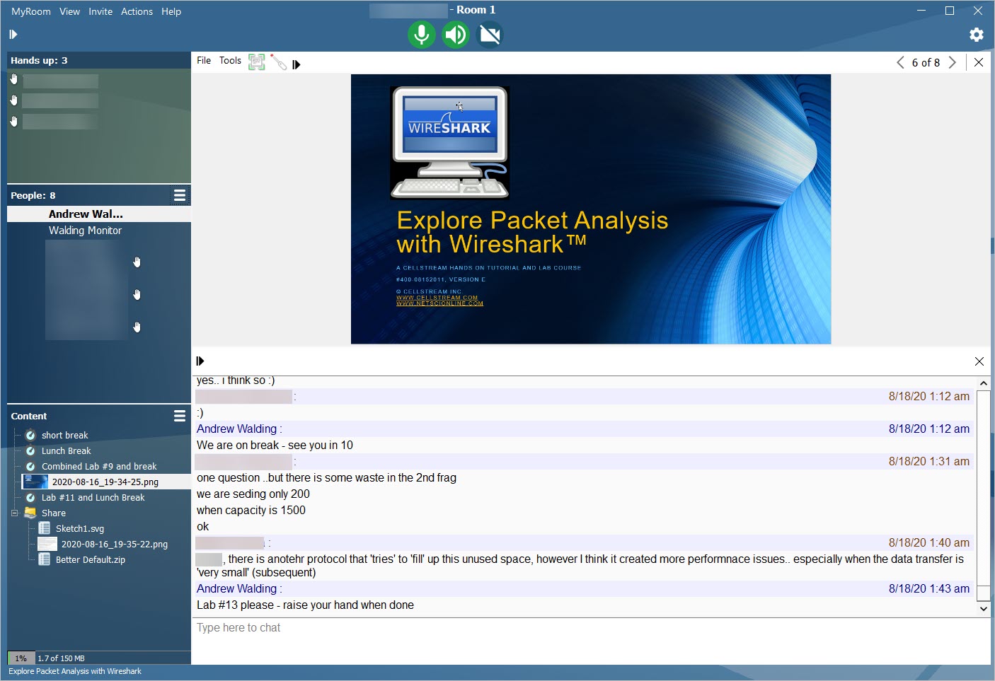
My Room has an older looking/feeling user interface, sort of Windows 2K. That said, the interface is tidy, and wonderfully compact, and shames Webex from a screen real estate standpoint.
The chat area works, as one would expect – no problem if a student/attendee shows up late, they will see the full chat history which you can also save, clear, and download easily. I also like the time stamps on the chat entries. The chat area of the screen is also better placed than either Webex or Zoom.
My Room also has a raised hand feature, but as you can see above, it provides an ordered list at the top of the participant window that is very useful. This is particularly handy when there are many attendees. Beyond that participant status, there is only an “Away” status, and I think My Room could add other status indicators to help the teacher/presenter know what is going on with attendees/students – this could be much improved.
I absolutely love the content window, making it easy to see what is uploaded and shared with students. I much prefer this as opposed to the tabbed approach used by Webex.
So while this application is not popular – it is actually very well designed, and the feature operations are better than the other two. I think HP should rebrand, update the look and feel of the UI, and relaunch this to gain market share.
ZOOM
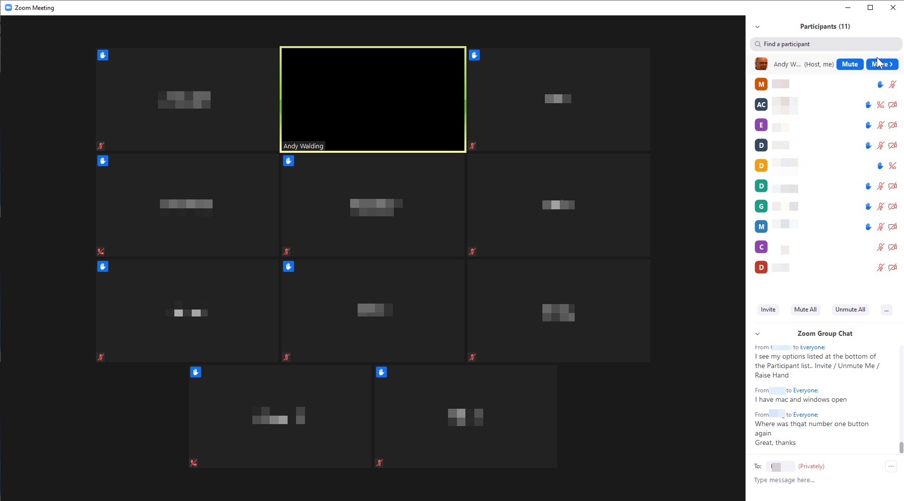
Zoom is the newbie among these platforms although we have been using it at the Online School of Network Sciences for almost 3 years now. The user interface encourages people to use their video by default, which in todays world is expected, though my experience has shown that like the other platforms most students choose not to be seen in extended multiple hour courses. That said, the video feeds are managed so much better that Webex or My Room, and the interface just feels more modern, simplified, and up to date. One small issue is with large groups, you end up having pages of faces, which becomes a bit unmanageable.
This platform is by far the most affordable, and it has soared in popularity since the COVID pandemic.
From a teacher/presenter perspective, the interface is very similar to the others and is straightforward. One super annoying thing is the raised hand for students/participants. Getting to it is ridiculously clunky (there is a temporary thumbs up and applause icon – but these disappear and are not useful) and to the contrary, a raised hand should be simple to select (you can see my students using this feature – but it took some time to get them to find this).
There are not as many easily viewed features like sharable attachments, and such. Attention tracking does not exist.
The chat feature works as expected. I also like that the Zoom interface expects the presenter/teacher to share their screen. As stated above this is the best way.
Rating The Applications
As for rating them, I will use the A, B, C, D, F grading system. If you are not familiar with this – read about it here.
| Webex: B | My Room: B- | Zoom: A- |
I think they all need improvement, tweaks, and bug fixes. I also think they all need to keep innovating and improving their interface and toolsets, some more than others. This is a crucial time for these applications, especially as so many people are now using them. To stay competitive and gain market share, they must be innovating quickly and efficiently.
Perhaps in the future I will use others, there are after all so many similar applications competing for our business.
What do you use? Which one do you prefer?

